Adult coloring has stepped out of novelty and into the studio, the clinic, and the research lab. Studies in art therapy and psychology now document what many practitioners have long intuited: that the repetitive, rhythmic gestures of filling a page can lower anxiety, regulate breathing, and sharpen attention, even as they open a more attentive way of seeing. Van Gogh–inspired coloring invites us to move, pencil in hand, through his charged color worlds — not simply copying his choices, but rehearsing our own responses to light, hue, and feeling.
What follows are five intertwined reflections on how to approach a Van Gogh coloring practice with the seriousness it deserves. Less a list of rules than an exhibition essay translated to the page, these notes ask you to consider materials, light and shadow, contrast, influence, and the quiet courage of experiment.
01 — On Materials
Choosing Instruments That Echo Your Gesture
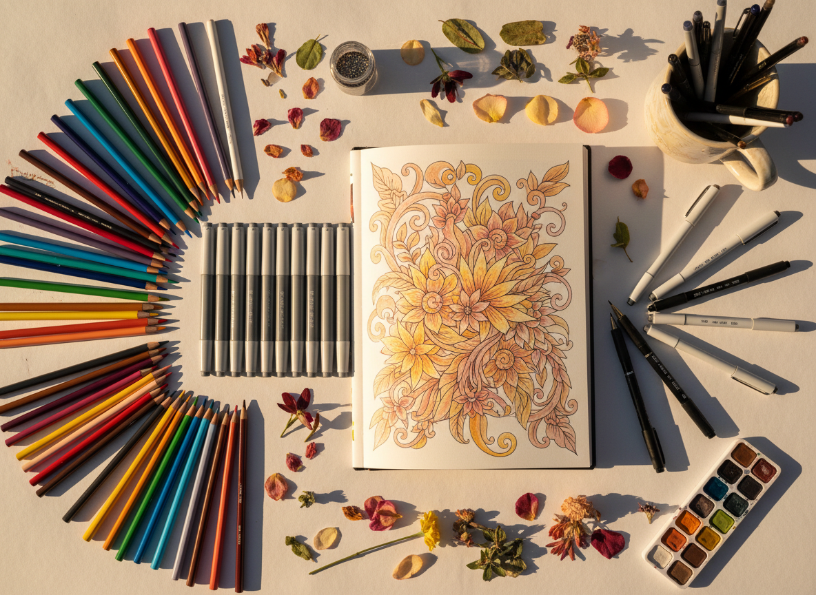
The tools you select shape not only the surface of the page but the tempo of your attention. There is no single correct medium, only the one that meets your hand where it is today. Colored pencils reward patience, allowing you to build slow, translucent veils of pigment until a form seems to rise from the paper. Alcohol markers offer a different pleasure: broad, velvety expanses of tone that recall the bold flat fields of a poster or print. Watercolors, with their capricious edges and pools of saturation, invite an almost impressionist looseness that feels close to Van Gogh’s own search for atmosphere. As you move between them, notice how each alters your breathing, your pressure, your willingness to linger on a sky or move swiftly across a field.
Let your choice of instrument be intentional. A fine pencil line will invite you to hatch, to layer, to whisper color into being. A brush pen will call for bolder commitments, for sweeping arcs of pigment. Each is a different conversation with the page; each can be true to Van Gogh’s restless, searching energy in its own way.
02 — On Light and Shadow
Letting Forms Emerge Through Layers
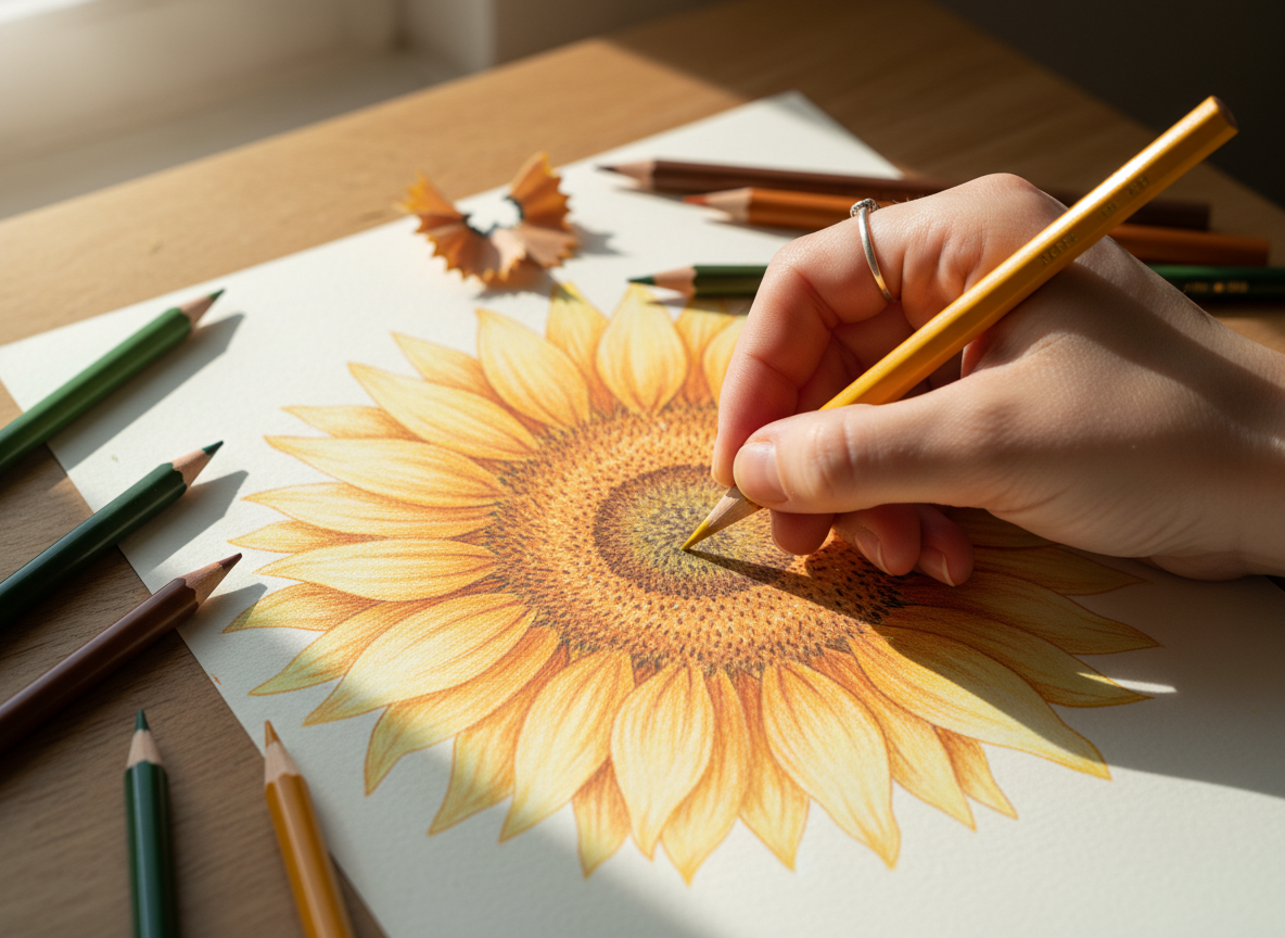
Shading is the quiet alchemy by which a flat outline begins to breathe. Rather than pressing hard and fast, allow the drawing to arrive in stages, beginning with the softest veil of color you can manage and deepening only as the forms become legible. Lay down a pale base tone, then return with medium and darker values to suggest the slow turning of petals, the weight of a vase, the curvature of a night sky.
Reserve your brightest highlights either by leaving the paper untouched or by gently reintroducing light with a white pencil. In this, you are close to Van Gogh’s own method: he did not blend his strokes into anonymity, but stacked them, line upon line, until texture itself carried the sense of light and movement. Your layering can echo that practice, inviting depth without sacrificing the liveliness of each mark.
03 — On Contrast
Letting Complementary Hues Do the Work
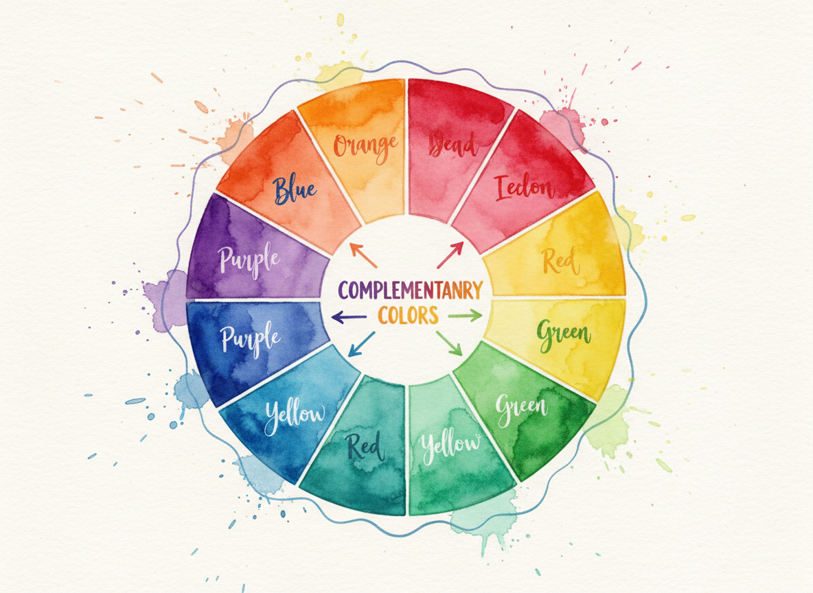
To understand why certain pages feel luminous, it helps to return to the color wheel. Complementary pairs — blue with orange, violet with yellow, red with green — sit opposite one another, and when they meet along an edge, each seems to flare brighter. Van Gogh grasped this instinctively. Think of the electric blue skies that ignite the gold of the wheat in Wheat Field with Crows, or the sharpened yellow of the stars pressing against the deep, unsettled blues of The Starry Night.
As you color, you can borrow this logic by letting complements define your focal points: a cool shadow adjacent to a warm highlight, a muted field that makes a single intense hue ring out. Allow contrast itself to carry much of the drama, so that the page glows without ever feeling crowded. A restrained palette, thoughtfully arranged, will often feel more powerful than an unchecked spectrum.
“I am always doing what I cannot do yet, in order to learn how to do it.”
— Vincent van Gogh
04 — On Influence
Studying Painters as Quiet Collaborators
No coloring page exists in isolation; every mark you lay down is in conversation with a much longer history of looking. To color with intention is to grant yourself time to study how artists before you have orchestrated hue, light, and shadow to guide the eye and carry emotion. Van Gogh offers a particularly generous model. He frequently refused strict naturalism, allowing his palette to tilt toward psychological intensity — painting, as he put it, what he felt rather than what he merely saw.
That permission is yours as well. Before you begin a page, pause with the original painting for a moment: what atmosphere are you drawn to, what temperature of light, what chord of colors? Let those questions shape your palette, so that your coloring becomes less an act of copying and more a quiet collaboration across time.
05 — On Courage
Coloring Without Fear of the Wrong Mark
Perhaps the most sustaining principle of all is the simplest: there are far fewer mistakes in coloring than we are taught to fear. There are hesitations, revisions, and the small shocks of discovery that come when a hue behaves differently on paper than it did in your mind. A stray stroke that wanders beyond the line, a pairing of colors that feels more dissonant than expected — these are not failures but data, traces of a live encounter with the page.
Van Gogh, writing of his own experiments, confessed, “I am always doing what I cannot do yet, in order to learn how to do it.” To approach each illustration as an open-ended experiment is to align coloring with mindfulness research itself: a practice of sustained, nonjudgmental attention. The goal is not flawlessness, but a state of focused, generous presence — a way of seeing that extends quietly beyond the page.
An Intimate Studio with Van Gogh
The Sunny Ink Van Gogh Colouring Book gathers twenty of Van Gogh’s most resonant works in quiet succession, each paired with a reproduction of the original painting and a brief account of the moment in which it was made. Moving through the book chronologically, you trace not only the evolution of his line and colour, but also the shifting emotional weather of his life — from luminous fields to interior rooms and restless skies.
For anyone drawn to colouring as a meditative, art-led practice, it offers a considered framework: a way to sit with one artist’s sensibility over time, returning again and again to the same pages as your own eye, and hand, slowly change.
References
- Bleicher, Steven. Contemporary Color: Theory and Use, 3rd ed. New York: Routledge, 2022.
- Calvo Ivanovic. “Analyzing Color Training in Design Education: A Review from 2010 to 2022.” Color Research & Application, 2024.
- Fine, Aaron. Color Theory: A Critical Introduction. 2022.
- Goldsmith, Ian. Colour Theory for Artists. 2024.
- Grovier, Kelly. The Art of Colour. New Haven, CT: Yale University Press, 2023.
- Khademi, F., et al. “The Effect of Mandala Colouring on Anxiety in Hospitalized COVID-19 Patients: A Randomized Controlled Clinical Trial.” International Journal of Mental Health Nursing, 2021.
- Solomon, Lisa. A Field Guide to Color. New York: Penguin Random House, 2019.
- Støre, S. J., and N. Jakobsson. “The Effect of Mandala Coloring on State Anxiety: A Systematic Review and Meta-Analysis.” Art Therapy, 2022.
- Turturro, N., and J. E. Drake. “Does Coloring Reduce Anxiety? Comparing the Psychological and Psychophysiological Benefits of Coloring Versus Drawing.” Empirical Studies of the Arts, 2020.
- Interacting with Color. New Haven, CT: Yale University Press, 2024.
 Sunny Ink
Leave a comment